01 / Case Study
MONITORING SYSTEM - PT KERETA API INDONESIA (KAI)
RideIndex
Turning ride measurements into a clearer view of railway comfort.
A web-based assessment and analytics platform designed to organize ride quality measurements, route data, and Ride Index results into a structured interface for easier monitoring and analysis.
Role
UI/UX Designer
Context
Machvory × PT KAI
Platform
Web Dashboard
Year
2025
Read Time
7–10 Min

01 / Overview
Making ride quality easier to assess and understand.
Ride Index
The project
Ride Index brings railway ride quality measurements into one connected experience.
The platform supports the assessment process from recording a train measurement to reviewing its results, bringing route information, Ride Index scores, and supporting measurement data into a structured interface.
My focus was on designing an experience that keeps this flow easy to follow — helping users move between assessments, location-based results, and deeper analytics without losing context.
Project details
Role
UI/UX Designer
Timeline
2025
Platform
Web Dashboard
Tools
What I worked on
From assessment flow to the final interface.
02 / Problem & Goal
From measurement
to meaningful insight.
The challenge
The interface needed to connect each stage of the assessment, without losing the context behind the data.
Keeping data connected
Assessment results combine train information, route data, Ride Index scores, and supporting measurements that need to remain connected throughout the experience.
Overview to detail
Users need a quick view of overall results while still being able to move into individual assessments and more detailed analytics when needed.
Data needs context
Ride quality measurements become more useful when users can understand where they occurred along the route, making location an important part of how the information is presented.
The goal
Make every assessment easier to follow from start to insight.
Create a clear experience that connects assessment records, route-based measurements, Ride Index results, and analytics while keeping both overview and detailed information easy to navigate.
Follow the journey
Start with the assessment.Keep the context.Reveal the insight.
Problem → Direction
03 / Process
Designing around the assessment journey.
I started by looking at how users move from an assessment record to its measurement details and eventually into analytics, using that journey to define how information should be organized across the interface.
01 / Information
Mapping what belongs to each assessment.
Each assessment brings together different types of information — from train and route details to Ride Index results, location data, and supporting measurements. I first separated these into meaningful groups before defining how they should appear across the experience.
Raw information
Organize
Assessment Context
Train, operator, assessment time, route, and status provide the context behind each measurement.
Ride Measurement
Ride Index scores, location data, telemetry, and vibration measurements describe the recorded ride condition.
Analysis
Summaries, trends, comparisons, and detailed results help users review measurements beyond a single assessment.
Prioritize
What should users understand first?
Which assessment am I looking at?
What does the ride measurement show?
Where can I explore the result further?
02 / Structure
Connecting the assessment flow.
Once the information was grouped, I explored how users could move naturally from an assessment overview into individual results and deeper analytics without losing the context of the train or measurement they were reviewing.

Exploration / 01
Early direction
Built around the flow.
The early direction focused on establishing relationships between assessment records, detailed measurements, maps, and analytics before refining the visual treatment of each screen.
Principle
Context before detail.Overview before analysis.Keep related data connected.
03 / Refinement
From connected flows to a clearer system.
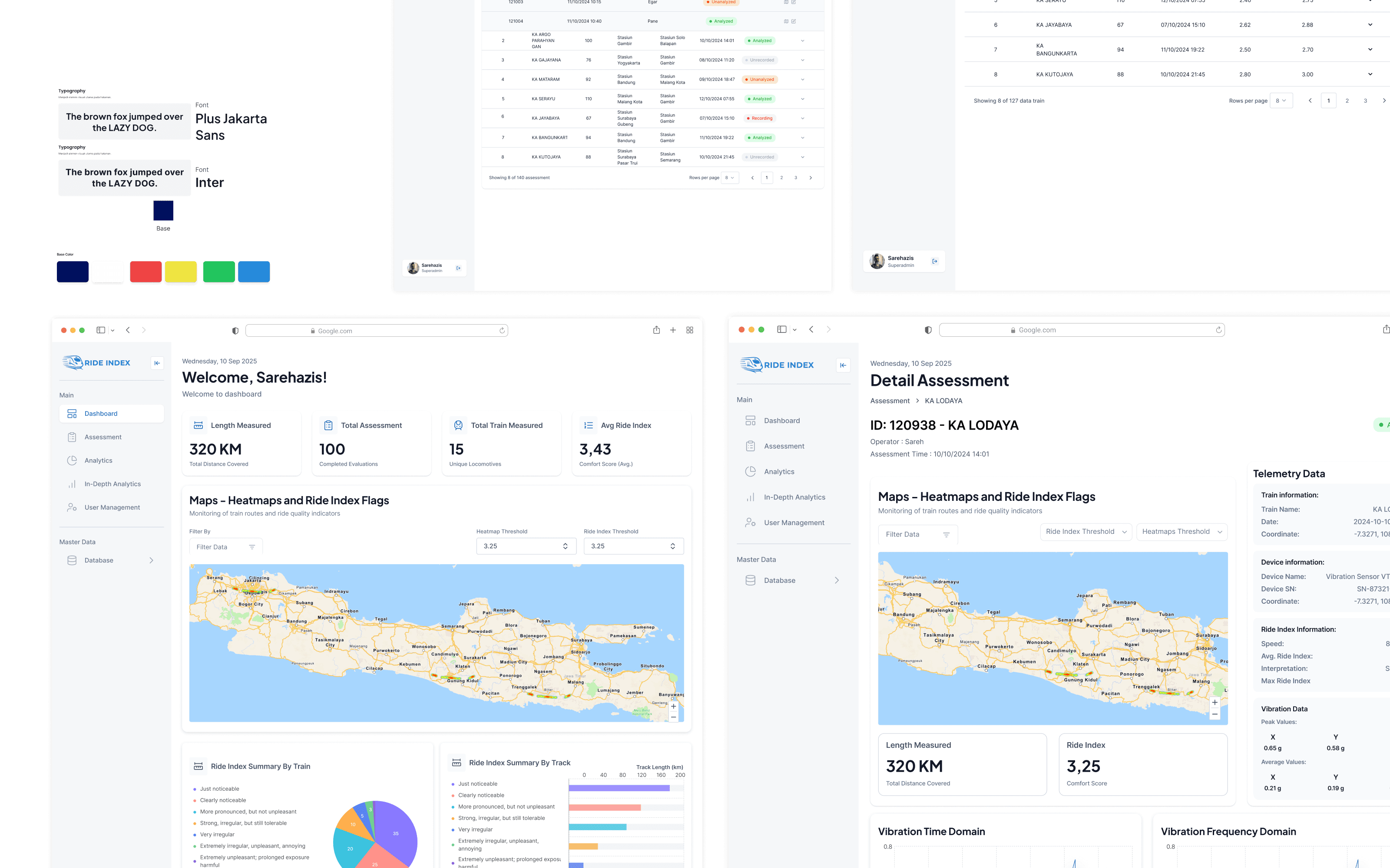
Refinement focused on making each stage of the assessment feel part of the same experience — keeping navigation, information hierarchy, status treatments, maps, and data presentation consistent across screens.
01 / Early structure
Wireframe

02 / Final direction
Interface

Keep the assessment visible.
Train, route, assessment, and status information remain easy to identify as users move between overview and detailed results.
Move from overview to depth.
Information is presented progressively, allowing users to start with summary results before exploring detailed measurements and analytics.
One system across every view.
Tables, cards, maps, status indicators, and analytics follow a consistent visual structure to make transitions between screens easier to follow.
Assesment → Context → Insight
04 / Design Solution
Bringing the journey into one experience.
The final interface connects assessment records, route-based measurements, Ride Index results, and analytics into one continuous experience — from reviewing a ride to exploring its details.
Dashboard Overview
Every ride starts with its assessment.
The assessment overview gives users a clear starting point to review recorded rides, identify their status, and access the information behind each measurement.

Ride Index / Dashboard
Design decisions
Assessment
Each ride keeps its context.
Train, route, time, operator, and assessment status stay connected to the measurement, making it easier to understand which ride the data belongs to.
Location
Measurements make more sense on the route.
Maps and location-based views connect measurement results to where they occurred, adding spatial context beyond numbers and charts alone.
Progression
Start simple, then go deeper.
Summary information comes first, while detailed measurements and analytics remain available when users need to investigate a specific assessment further.
02 / Monitoring
A closer look at every ride.
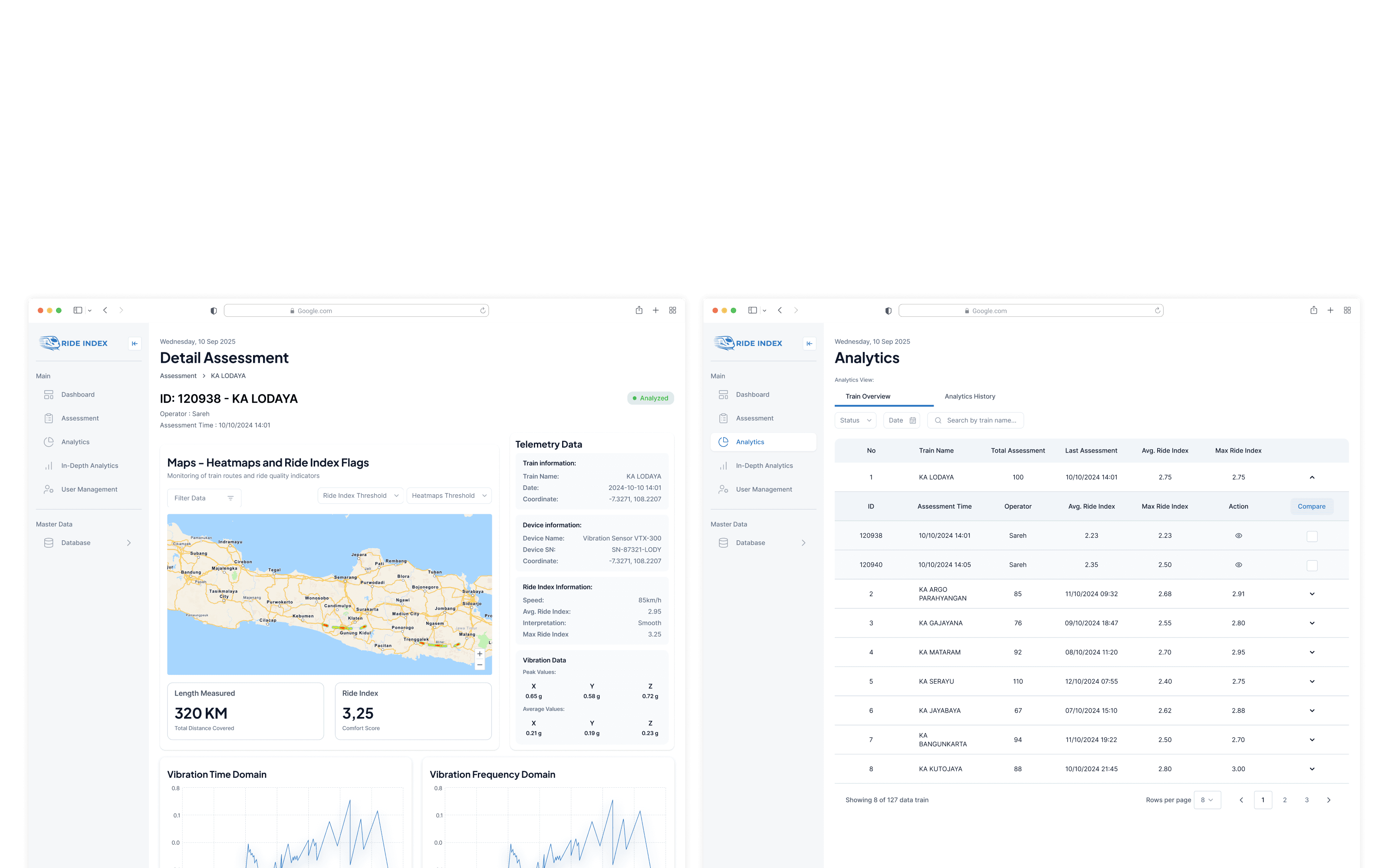
Each assessment brings the ride information, route, Ride Index results, and supporting measurements together, giving users a more complete view of what happened during the journey.
Record → Locate → Review
03 / Data Visualization
Making ride quality easier to read.
Ride Index scores, vibration measurements, and other recorded data are presented through charts and visual summaries, helping users see changes and patterns across a journey without relying on raw values alone.
04 / Interface Details
From overview to deeper analysis.
Analytics provides a broader view across assessments, while detailed views let users explore individual rides, measurements, and Ride Index results without leaving the overall system context.
01 / Monitoring components
Detail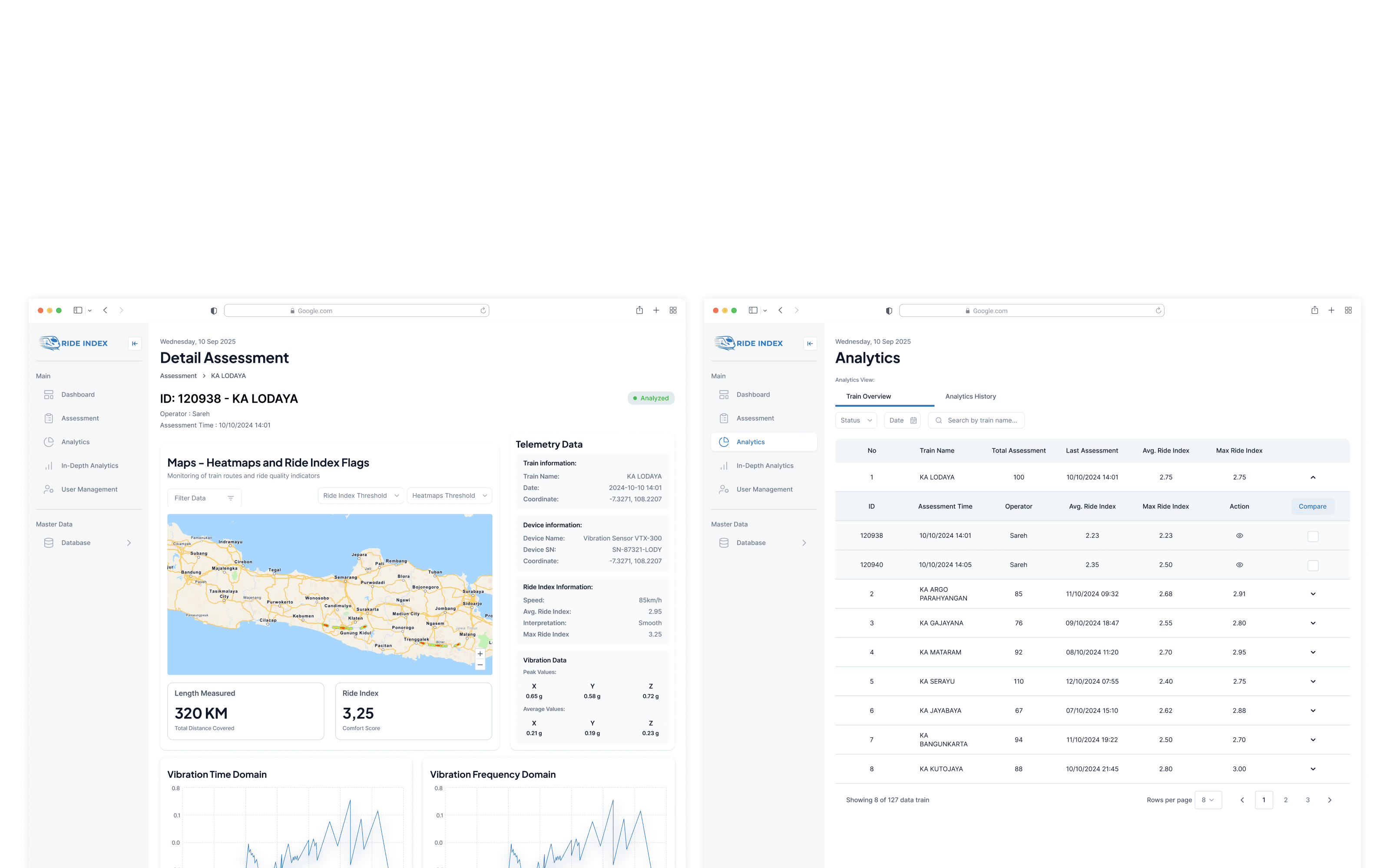
02 / Interface language
Detail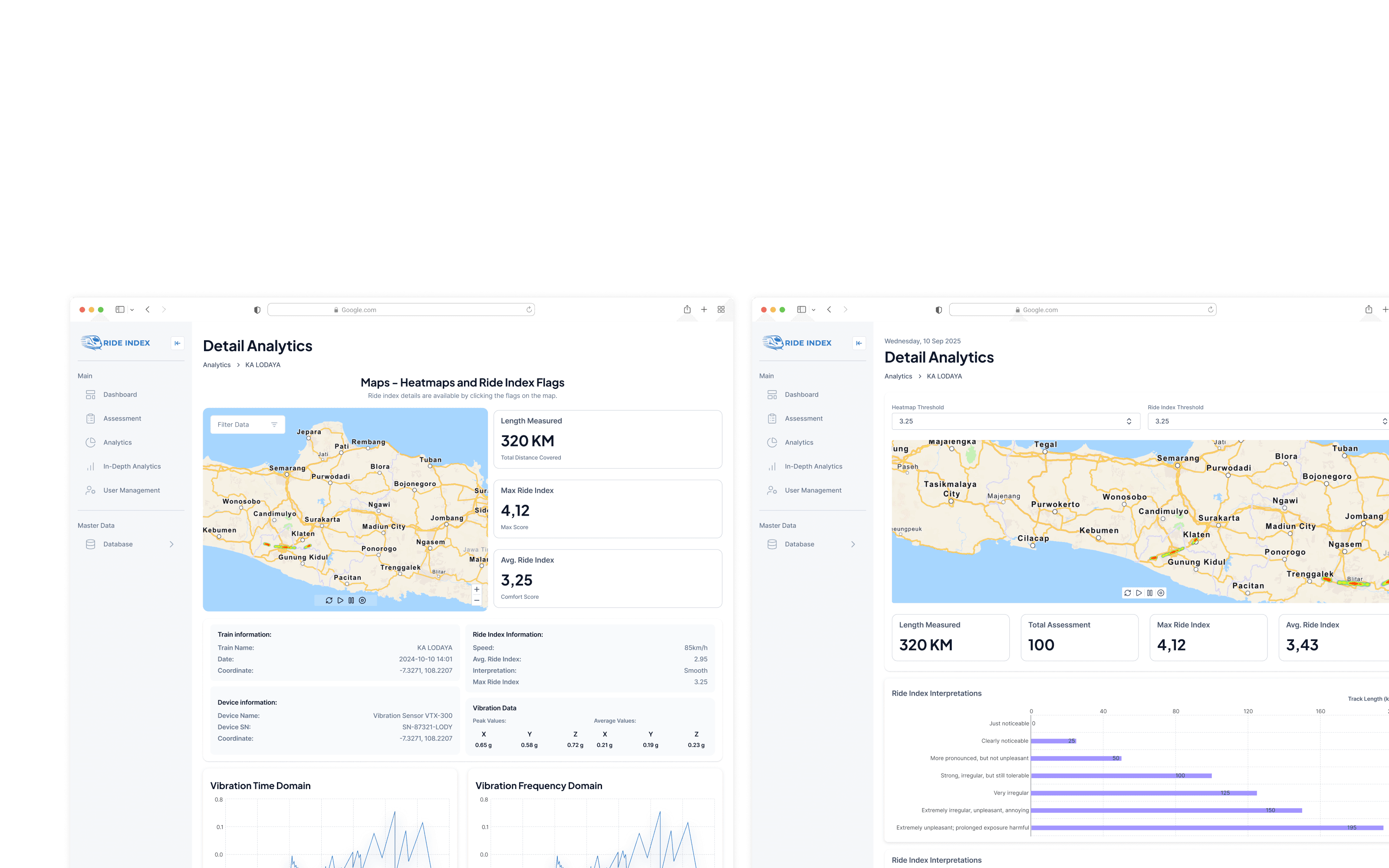
The result
The result is an experience that keeps every stage of a ride assessment connected from measurement to analysis.
Assessment → Context → Insight
One journey. Different measurements. One connected view.
05 / Outcome
One connected experience from ride to insight.
The outcome
The final design brings the assessment journey into a more structured experience, connecting train information, route-based measurements, Ride Index results, and analytics across the platform. the overall condition before diving into the details.
Information no longer competes for the same level of attention.
Hierarchy, grouping, and status guide users toward what matters first.
What I learned
Three principles I'd carry into the next product.
Clarity before decoration.
With technical information, deciding what deserves attention matters more than adding more visual elements.
Context makes data useful.
Status, hierarchy, and supporting context help users understand what the numbers actually mean.
Design the system, not just screens.
Reusable patterns and clear relationships create a more consistent experience across the product.
Reflection
Good monitoring design isn't about showing everything. It's about helping people know what to look at first.
Designing beyond individual screens,
Designing beyond individual screens,
Designing beyond individual screens,
Ride Index
End / 02
Next / 03
Continue exploring
Another project,
another problem to solve.
Continue to the next selected project.

Project / 03
Kaigo Fukushishi
2025