01 / Case Study
MONITORING SYSTEM - PT KERETA API INDONESIA (KAI)
GroundDetector
Making railway monitoring data easier to understand at a glance.
Ground Detector is a web-based monitoring system that helps Balaiyasa teams, Depo teams, and Kantor Pusat teams keep track of locomotive conditions, ground events, and operational data in one place.
Role
UI/UX Designer
Context
KAI - Balaiyasa Monitoring
Platform
Web Application
Year
2025
Read Time
7–10 Min

01 / Overview
Making railway monitoring easier to read and navigate.
Ground Detector
The project
Ground Detector brings locomotive monitoring into one clear interface.
The project involved a lot of operational information — from locomotive conditions and ground events to monitoring data across Balaiyasa operations. The challenge was figuring out how all of that information could live in one interface without making it feel overwhelming.
My focus was on organizing the experience, building a clear visual hierarchy, and making important information easier to find. The goal was to help users move from a high-level overview to more detailed monitoring data without getting lost along the way.
Project details
Role
UI/UX Designer
Timeline
2025
Platform
Web Application
Tools
What I worked on
Shaping the experience from flow to interface.
02 / Problem & Goal
A lot to monitor
without losing the important stuff.
The challenge
Ground Detector brings different types of operational data into one dashboard, so the challenge was deciding what users needed to see first.
A lot of information
Locomotive conditions, ground events, monitoring data, and management information all needed a place in the same product without making the interface feel crowded.
Different levels of priority
Not every piece of information needs the same attention. Current conditions and important events needed to stand out before users moved into more detailed data.
Moving between overview and detail
Users needed to move from a general view of operations into specific locomotive and monitoring details without losing context along the way.
The goal
Make monitoring information easier to understand at a glance.
Create a clear monitoring experience where users can quickly understand current conditions, spot information that needs attention, and move into deeper operational data when they need it.
Overview first, details when needed.
See the condition first.Find what needs attention.Go deeper when needed.
Problem → Direction
03 / Process
From complex information to a clearer experience.
I started by understanding the information the system needed to present, then organized it into a structure that could support both quick monitoring and deeper analysis.
01 / Information
Organizing information around how it is used.
The system brings together locomotive conditions, ground events, live monitoring, analytics, and management data. I grouped related information based on what users needed to monitor, investigate, and manage.
Raw information
Organize
Monitoring
Current locomotive conditions and ground events that need to be checked during operation.
Analysis
Historical data, trends, and event distributions used to understand operational patterns.
Management
Supporting data for locomotives, depos, sensors, analyzers, and users.
Prioritize
What should users see first?
Current condition
Operational context
Deeper analysis
02 / Structure
Turning hierarchy into an interface.
Once the information had a clearer hierarchy, I translated it into navigation, dashboard sections, tables, status indicators, and analytics views.
Exploration / 01
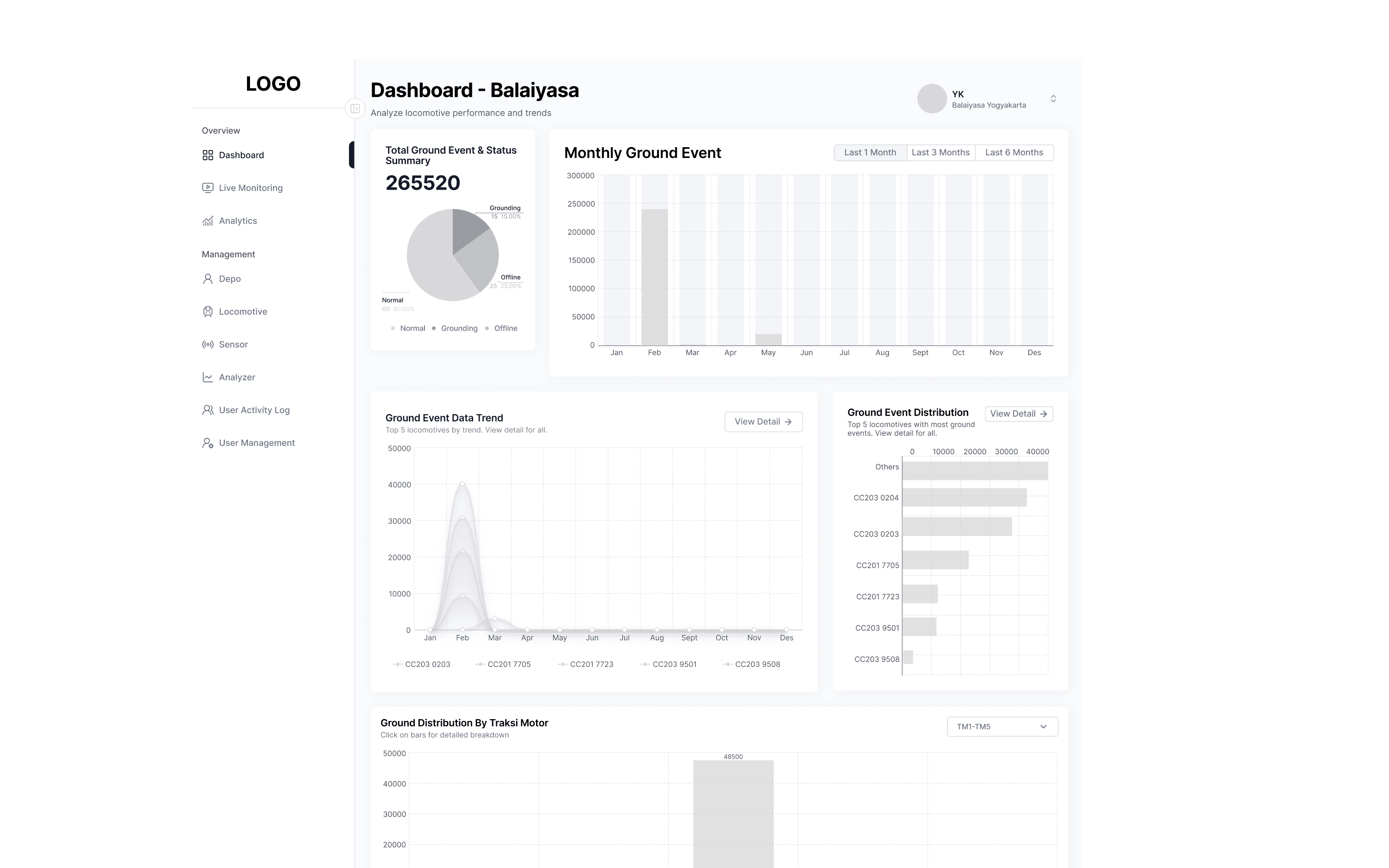
Early direction
Started with structure.
I started by mapping how Balaiyasa users would move between monitoring, analytics, locomotive data, and supporting management features before defining the visual direction.
Principle
Structure first.Visual decisions later.
03 / Refinement
From structure to clarity.
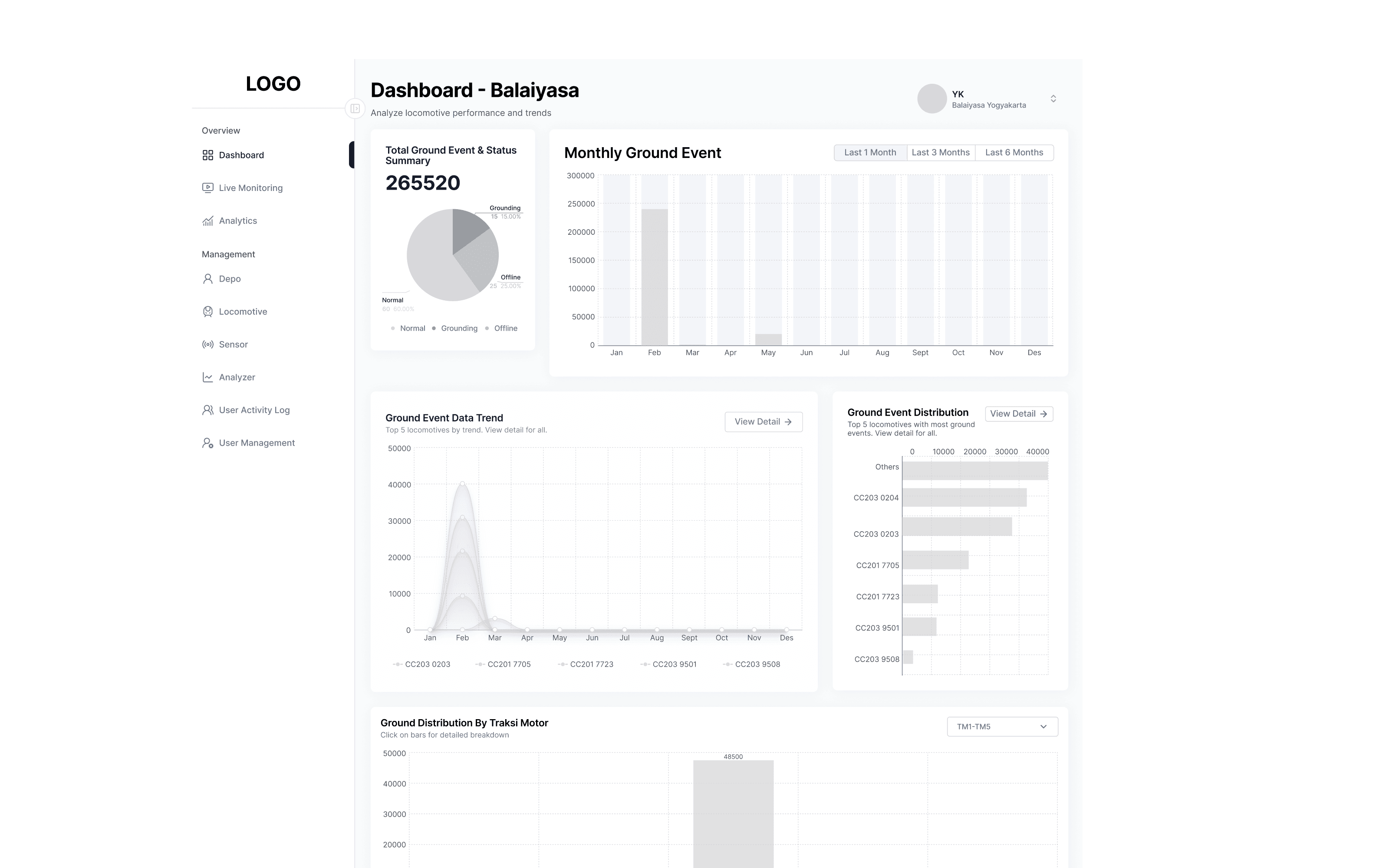
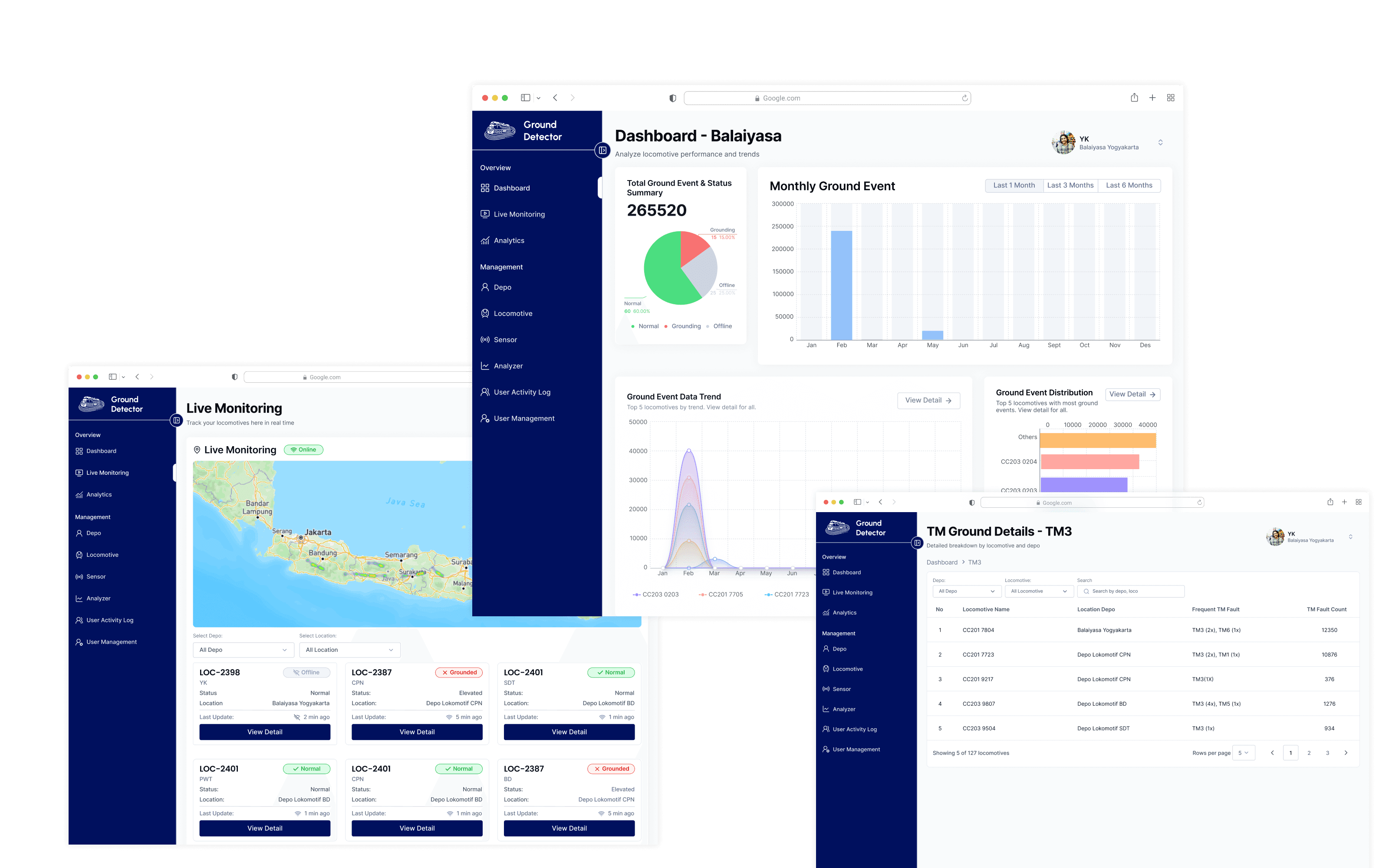
With the core structure in place, I refined the interface around the information Balaiyasa users needed most — making locomotive conditions, ground events, and operational trends easier to identify and compare.
01 / Early structure
Wireframe
02 / Final direction
Interface
Structure
Role-based structure Organizing monitoring, analytics, and management features around the needs of Balaiyasa users.
Hierarchy
Operational hierarchy Giving current locomotive conditions and ground events more visual priority than supporting information.
Clarity
Scannable data Using status, charts, grouping, and spacing to make dense monitoring information easier to scan.
Complex data → Clear structure → Faster understanding
04 / Design Solution
Bringing the system into one clear view.
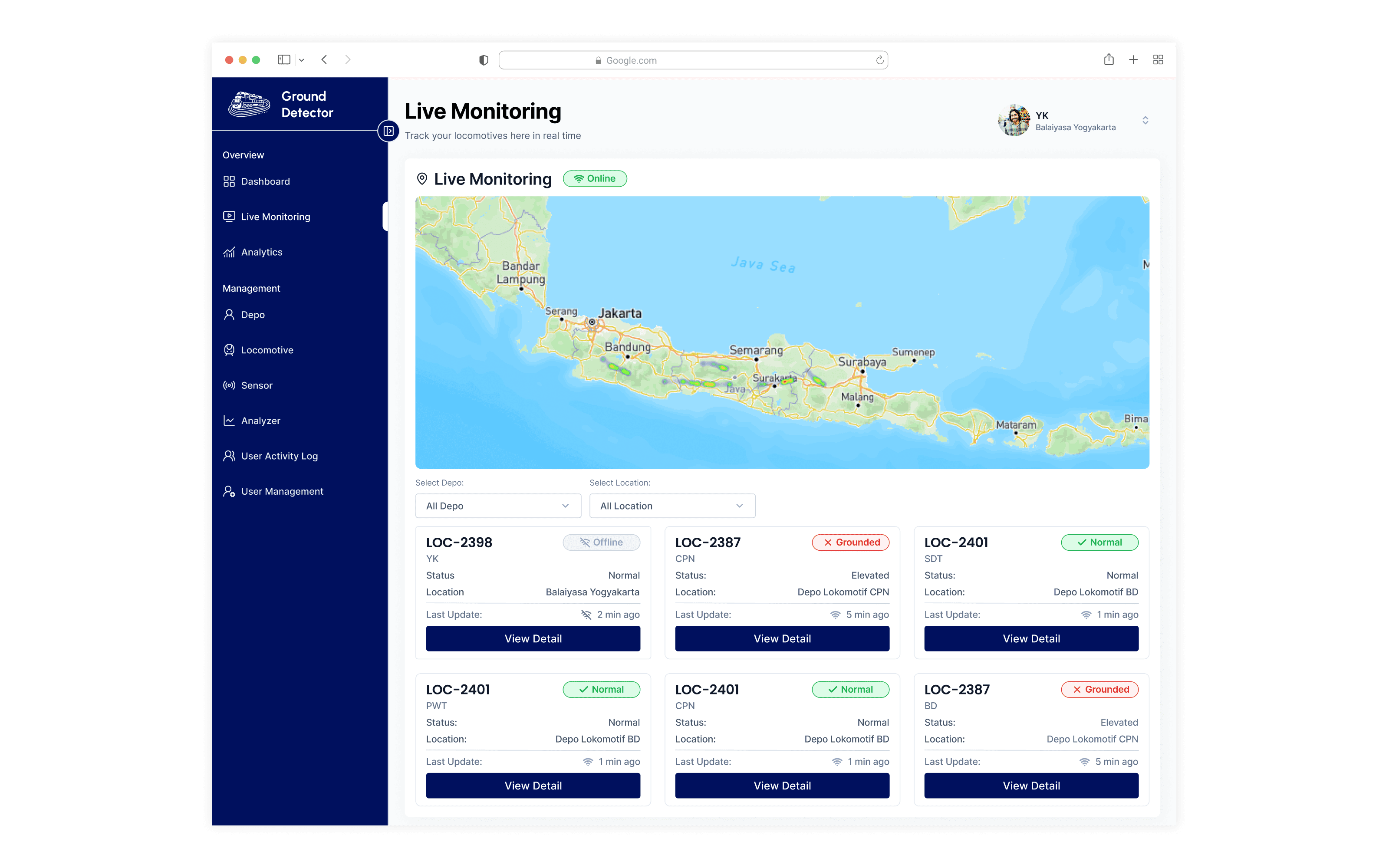
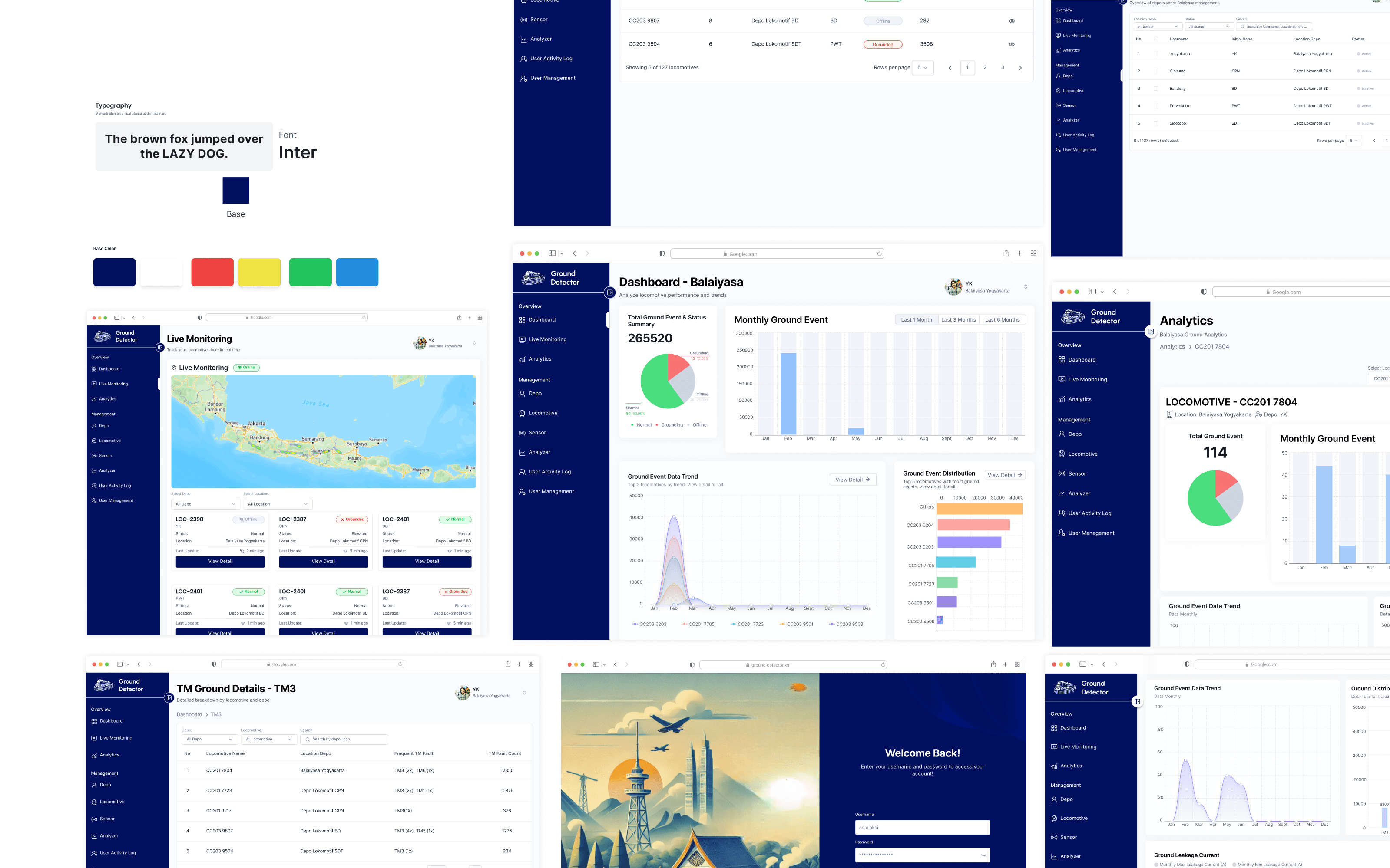
The final interface brings monitoring, locomotive conditions, ground events, and operational data together in a structured experience built around the needs of Balaiyasa users.
Dashboard Overview
Everything starts with the overview.
A high-level view of locomotive status and ground event activity, giving Balaiyasa users the context they need before exploring individual locomotives or deeper analytics.
Ground Detector / Dashboard
Design decisions
Overview
Important information comes first.
Key status summaries and ground event trends are placed at the top level, so users can understand the overall condition before moving into detailed data.
Status
Conditions are easier to recognize.
Consistent status indicators help distinguish normal, grounded, and offline locomotives without relying on numbers or detailed records alone.
Data Visualization
Trends are easier to compare.
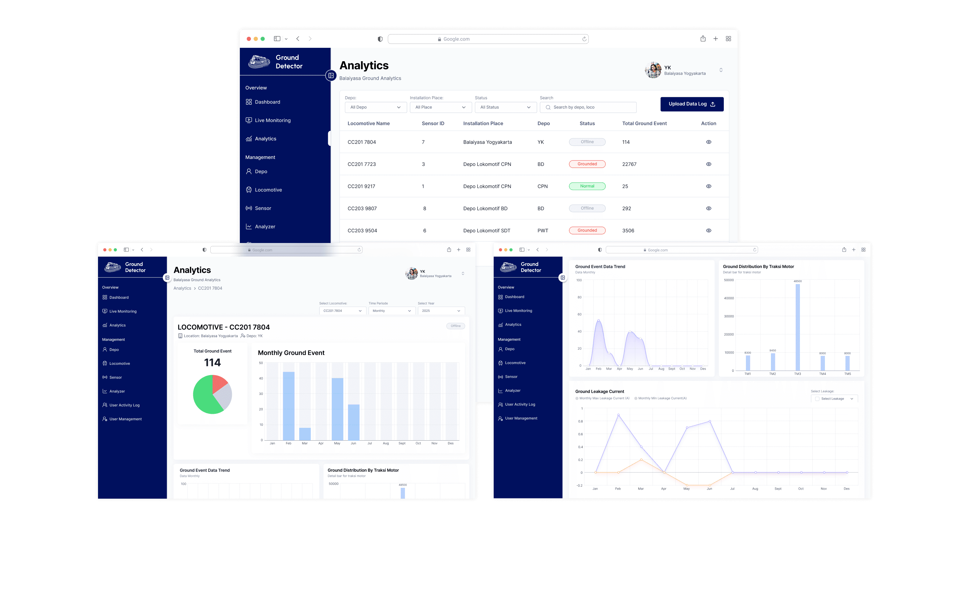
Charts turn ground event data into visual patterns, helping users compare activity across time and locomotives without reading through rows of raw data.
02 / Monitoring
Monitoring at a glance.
The monitoring interface brings locomotive positions, operational status, and ground event information into one view, allowing users to quickly identify current conditions and move into more detailed information when needed.
Scan → Understand → Explore
03 / Data Visualization
Turning data into patterns.
Instead of showing operational data as isolated numbers, charts and summaries help reveal patterns, trends, and differences across ground events over time.
04 / Interface Details
Small decisions, consistent experience.
A consistent visual language across components keeps different parts of the monitoring system connected and predictable.
01 / Monitoring components
Detail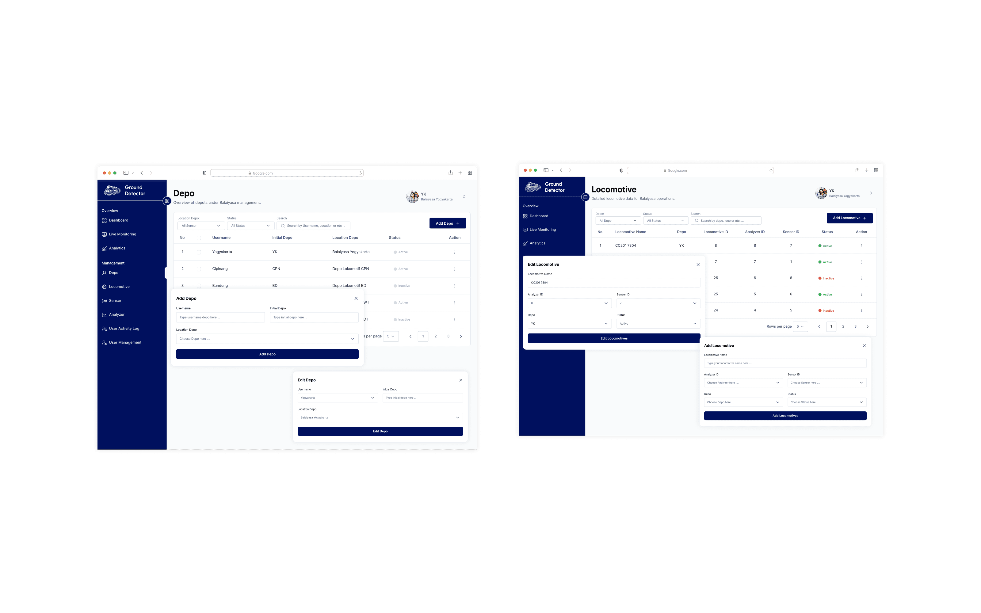
02 / Interface language
Detail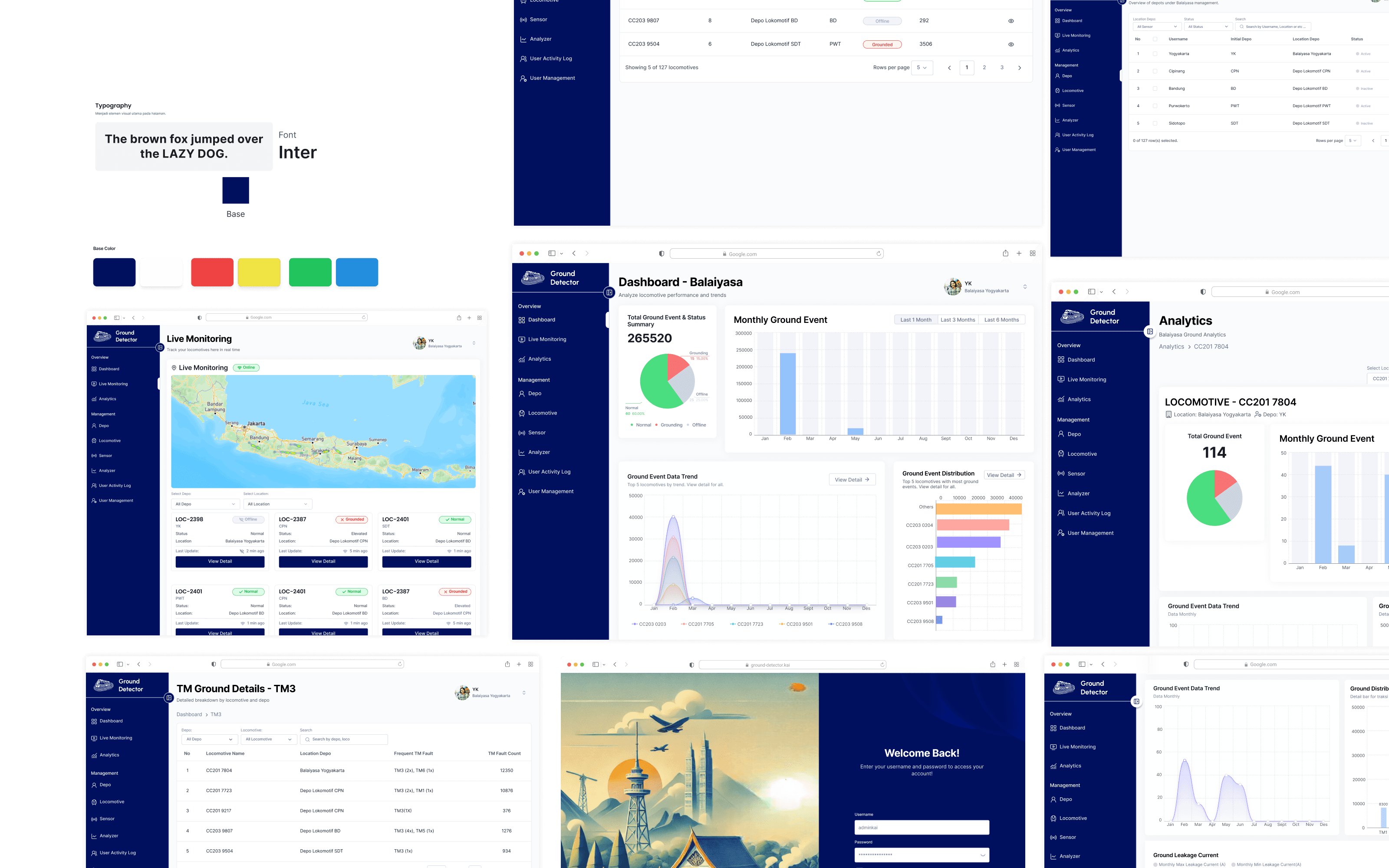
The result
Technical information stays visible without making the experience feel technical.
Clarity over complexity
Structure → Interface
05 / Outcome
Less about showing data. More about making it understandable.
The outcome
A clearer monitoring experience where users can understand the overall condition before diving into the details.
Information no longer competes for the same level of attention.
Hierarchy, grouping, and status guide users toward what matters first.
What I learned
Three principles I'd carry into the next product.
Clarity before decoration.
With technical information, deciding what deserves attention matters more than adding more visual elements.
Context makes data useful.
Status, hierarchy, and supporting context help users understand what the numbers actually mean.
Design the system, not just screens.
Reusable patterns and clear relationships create a more consistent experience across the product.
Reflection
Good monitoring design isn't about showing everything. It's about helping people know what to look at first.
End of case study
One project done.
A few lessons kept.
Ground Detector
End / 01
Next / 02
Continue exploring
Another project,
another problem to solve.
Continue to the next selected project.

Project / 02
Ride Index
2025